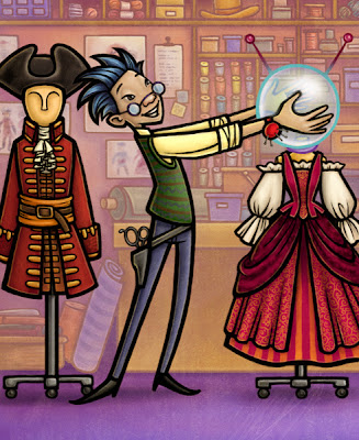
The above illustration was for the little reader
The Case of the Missing Manny, which was done for Imagine Learning. It happens on the set of a pirate movie, so this picture goes with the page when our detective Ace is interviewing Bob the costume designer. Bob, btw, hates pirates and wishes he could design costumes for sci-fi movies.
I've put together a big ol' tutorial on how I made this illustration. I tried keep it at the level of expecting the reader to know at least the basics of Photoshop, but if you are an expert at Photoshop, then a lot of the information will be old hat. If I've left big holes in my explanations, let me know and I'll be happy to make some edits.
Tools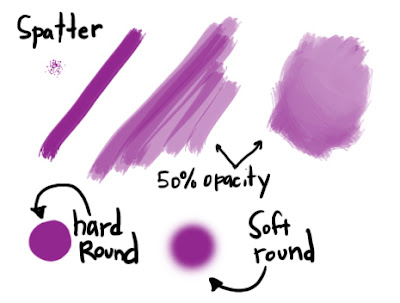
These are the brushes I will be referring to throughout the tutorial. I am pretty lazy with brushes - I stick with what works. All three brushes are in the default brush palette. The only customizing I've done is to save a couple more spatter brushes at smaller sizes. When I'm in a real hurry while shading, I'll just use the soft round brushes. The downside is that you get a slick airbrushy look that I don't always like. The spatter brushes give me a little texture to the brush strokes.
Some other general type information - I have two different setups. At my Imagine Learning office, I work on a PC. I have two 1200x1600 LCD monitors, an Intuos Wacom tablet, and Photoshop CS2. There's a screenshot of my desktop a little further down. At home I have essentially the same setup, only with a G5 mac and PS CS3. I personally prefer the mac over pc, but I've worked with both for so long, that it's not an issue for me. (Speaking of apple love, recently got an iphone and they are pretty much lots of awesome .)
This whole illustration was done in Photoshop from start to finish. Sometimes I use Flash or Painter, but for this tutorial, everything I refer to is happening in Photoshop, and I'll be using PC commands. If you use a mac, just replace Ctrl with Cmd.
Thumbnail
Here is my first sketch, which is essentially a thumbnail, even though it is done at actual size but lower resolution (72 dpi). I'm using a small round brush. It looks like it was maybe at 30% opacity. I’m not consistent with that. This first sketch is just to figure out what is happening in the scene and work out the general composition. Before starting any sketches for the project, I had already done some research, finding pictures of costume studios, pirate costumes, etc. to help come up with ideas.
The Sketch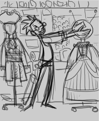
After I’ve figured out where everything goes, I lower the opacity of the thumbnail layer and add another layer on which to do a tighter sketch. Before I can go any further, I need the sketch approved. Usually I would do a tighter sketch for approval, which would not require any guesswork on the part of the art director. But this was for my inhouse job, and we are a little more autonomous, plus I’ve been working with these designers for years, and they can make the leap to trust how the final will turn out.
The sketch is approved. (I actually sketched the whole book to this stage, and had it approved all at one time.) I increase the file to 300 dpi. Even though this is an online book, I try to do the finish at 300 dpi in case we ever need to print them. I lower the opacity of the sketch layer, and add another new layer for the final lines.
Tracing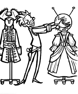
I am unable to make nice freehand clean lines. I could never do it with a pen, and still can’t on the computer, my hand is too shaky or something. So I have to come up with ways to make nice lines. For this book I’ve decided to make big fat lines and then clean up the edges. I use a small spatter brush at 100% opacity to draw the lines. Once done, I go around and fatten up the edges some more.
Nice Lines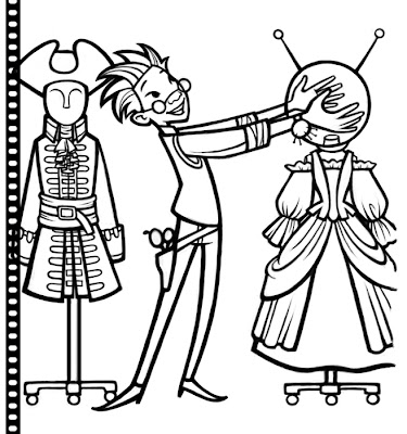
There are a couple ways to go about cleaning up the edges. I could toggle my brush between eraser and the brush (keyboard shortcuts E and B), or I could use just a brush and toggle between black and white (Keyboard shortcut: X to toggle between foreground color and background color in the tools palette, D to reset to default colors, so in my case black and white.) Since this isn’t just a small touch-up, I opted to go with the black/white option.
My black lines were on a transparent layer, and now there is a lot of white all over from the clean-up. If I don't want that white to show up over the color on lower layers, there are a couple things I can do. The easiest is to set the line layer to multiply in the layers palette. But since I want to color my lines later, I need to get rid of the white. So I will make a channel.
First I click on the Channels tab in the Layers palette. At the very bottom of the palette are four little icons: click on the first icon of a dotted circle. This creates a channel (selection) of all the white (not the black lines.)
Click back on the Layers tab, and create a new layer. Inverse the selection so now you have the black lines selected instead of the surrounding white. Shift+Ctrl+I or in the menu: Select > Inverse Selection.
On the new layer, fill the selection with black or whatever color. Alt+Delete or Edit > Fill… The black line is now on a transparent layer with no white around it. The old layer is deleted.
Lines Detail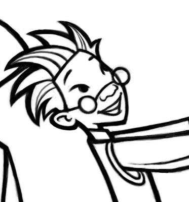
I used a spatter brush at 70% opacity to clean up the edges. It kept the line a little rough, which I think makes it a little more interesting. If I’d wanted a slick clean edge, I would have used vectors instead.
Finished Lines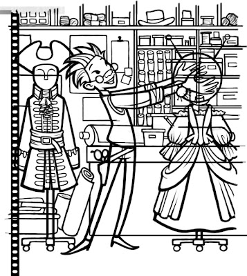
So here are all the final lines. I did the lines in two separate layers because when it comes time to color the lines, the foreground lines I want to remain black, and the background lines will be a different color. It also makes it easy to put different color layers in between the foreground and background if I want to push it back, put a tint over everything, etc.
Another line trick, to make straight lines using the brush tool, hold down the shift key, and it will lock your brush to vertical or horizontal lines. To make straight lines at an angle, make a dot, lift the brush, hold down the shift key, and then put the brush down where you want the end of the line to go, and a straight line will be drawn to connect the two dots.
Solid fills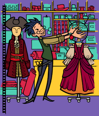
Now it's time for the fun part. My first step when starting in on the coloring is to make solid areas of colors. These don't necessarily need to be related to the final color, it's just a step to isolate different areas for shading. For this illustration I did this on five layers. One layer is of Bob and his costumes, second layer is of half of the background "stuff" (hot pink), third layer is of the turquoise background things, fourth is of the table and shelves, fifth is the purple background.
Since this illustration has nice solid black lines, I can use those lines when filling in the colors. Using the magic wand to select the area I want to fill, I then go into the Select menu, choose Modify, then Expand. I expand the selection by 2 or 3 pixels. On the layer beneath the lines, I can then fill the selection with my chosen color (Alt + Delete).
How I break up the layers depends on how fast I have to get it done, how complicated the piece is, how sure I am of the color palette (more layers make it easier to make adjustments to isolated areas later). Since the colors are clearly separated by a bold line, it is easy to use the magic wand to select the color areas to shade. The items in the background were divided up so that items that overlapped were on separate layers.
Once I have colors filled in everywhere, I turn on the Preserve Transparency feature of each of these layers. At the top of the Layers palette there are four small boxes after the word Lock. The first checkered box is the Preserve Transparency box. When checked, anything you do on that layer only affects what is already there. If you have a box at 30% opacity, you can color on it with a 100% opacity brush, and it will remain at 30% opacity. This is great feature for coloring lines. That's why earlier I had removed the white from my black lines - it will make it easy to color them.
Rough colors
Next I try to settle on some actual colors. Since I've already done an illustration with this character, I just use the eyedropper tool and pick out his colors. I tried several colors for the pirate costumes, and decided I liked the red and pink. One way to test colors is to select the area with the magic wand, and then open up the Hue/Saturation dialog box (Image > Adjustments > Hue/Saturation or Ctrl + U) and then play with the sliders to find a color you like.
Since my background lines were on a transparent background, I can turn on Preserve Transparency, and use fill to change the color. Or I can use the Hue/Saturation box to try out different colors, or I can take a brush and color specific areas, without ever losing the line. I love Preserve Transparency.
Shading and screenshot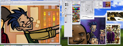
Once I've worked out an overall color scheme, I can start the shading process. I always start with the face. I used the magic wand to select Bob's skin. I'm using the spatter brushes at 30% opacity. I have my color palette set to HSB sliders. I use that to make a dark shadow color. Then as I start shading I am constantly using the alt key to toggle to the eyedropper tool and picking colors as I'm painting them to make a nice gradient in the shading.
Above is what my desktop looks like at this stage. I have open the illustration I've already done with Bob, so I can match his colors and grab them with the eyedropper. You can also see some of the reference I found of costumes and costume shops. You can see my big color picker palette. This has just sort of grown over the years, and I've never bothered to organize it. It works as a nice place to start, and adjust colors from there.
The details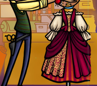
After getting the basic shading done, I'll go back and add some details. To make this swirly pattern on the dress, I added another layer, I drew in the curly-cues at 100% opacity with a small hard round brush. I turned on Preserve Transparency, then picked a gold color from my palette and then used alt + del to fill the swirls with the new color. I used the color slider to make a darker shadow color and airbrushed in some shadows with the soft round brush. I then set the whole layer at about 50% opacity to make it a little more subtle.
Edit: If you are a little unclear about how Preserve Transparency works, scroll down to the end of the tutorial for some clarification.Finished foreground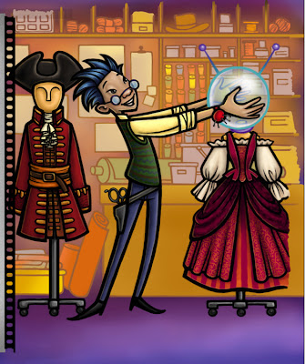
Another tool I love to use while shading is the smudge tool. It looks like a little hand with a finger pointing down. If you don't know where it is, it is under the blur raindrop in the tools palette. Keyboard shortcut: R. The smudge tool is great for smoothing out brush strokes. I like to use it for hair. I can use a spatter brush with the smudge tool and make streaky looking hair. It's also great for things like ripple reflections in water.
The final step is to do a little touch-up on a layer above the lines - things like the little pins in the pin cushion, highlights in the eyes, etc.
Almost finished: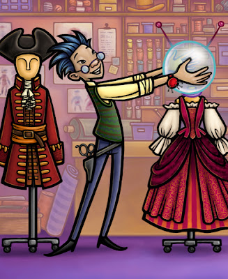
Here's after I've finished all the shading. Earlier the background was a little more mustard yellow, which I decided I didn't like. I made a new layer between the background and foreground elements, filled it with a light lavender color, and set the layer properties to Soft Light. It softened the background color, and pushed it back a little more to separate it from the foreground.
Texture: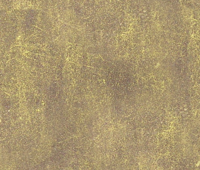
The finishing touch is to add a texture over the whole thing. I have this scan of a piece of metal that I like, so I drag that into my file as a new layer on top of everything else. I set it to Soft Light at 50% opacity. Sometimes Overlay works well with textures. I just experiment with the layer properties drop down to see what looks good.
The final illustration with text box: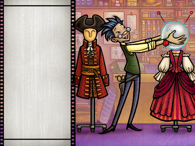
So that's the big long tutorial for this illustration. I hope there was something useful in there somewhere. I don't always work this exact way, but there are a lot of principles that I use no matter the style. Feel free to ask questions, I'm sure I left things out.
EDIT: Maggie had some good questions about Preserve Transparency, so here is an attempt to be a little more thorough in my explanation.
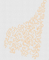
I thought I would stick with the swirls on the dress as the example. I drew the swirls on a transparent background with a 100% opacity hard round brush. This is what it looks like with every other layer turned off.

I added a layer directly beneath the swirl layer and filled it with red so we can better see what's going on. But the swirl layer is still only swirls (no red).
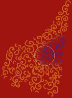
Once I've turned on Preserve Transparency, I can shade the swirls all I want, and I will not shade anywhere that was already transparent on the layer. I am shading directly on the swirl layer. This sample is showing that I've selected a purple color and a large soft round brush at 100% opacity. As I draw across the swirls, it is only affecting the swirls and not filling in the transparent area.

So for the actual illustration, I used a soft round brush, at a lower opacity, and painted in some shadows on the swirls themselves. Once I had the shading to my liking, I lowered the whole layer's opacity so it would appear more subtle against the pink fabric of the dress.
Preserve Transparency is a great tool for coloring lines, or way to avoid using selections. Probably the best way to learn how to use it is to make a new transparent layer, draw some lines, turn on PT, and experiment to see what happens.



