Wednesday, December 24, 2008

season's greetings and stuff


Once again, I didn't quite get it together to send out Christmas Cards, much less paint something new for a card.... so I grabbed some pieces from a job I did last year for Home Depot and made this nice little seasonal salutation for y'all. I think I did the lines in Flash and then colored everything in Photoshop. I had to make elf heads and bodies and hands and arms all interchangeable for the ad people to set them up however they wanted. I never did see the final set up, but it was supposed to be a big end cap for cleaning supplies, hence in my files these are called the Swiffer Elves. :-)

Have a wonderful season of festivities, and I wish a wonderful new year to you all!
-Maryn

Saturday, December 20, 2008

interesting internet facts


So every once in a while, it's fun to Google your own name to see what comes up. It's interesting, and maybe a touch creepy. Taking a little break from some sketches, I thought I'd see what came up. I learned some interesting things.

1. Apparently there is another Maryn Roos out there with a Facebook account. I don't have the time or inclination to deal with Facebook or MySpace or sites like that, and the whole friend thing makes me uncomfortable. But I wonder who the other Maryn Roos is. I wonder if she's the good version, and that makes me the evil bizarro Maryn.

2. Apparently I have a middle name, and it is Boyde. Huh. When I little, I was always self-conscious over the fact I didn't have a middle name. I have kid drawings where I wrote different middle names all the time. Guess I was trying them out. The favorite that seemed to stick was Rosie, and all through college I would sign my paintings M. Rosie Roos. The Boyde bit isn't that out there though - my dad's middle name was Boyde, so somehow it's gotten attached to me. I actually get junk mail for Maryn B Roos all the time.

3. I stumbled across an illustration I did earlier this year in someone else's portfolio. (It's all legit - no worries.)

4. A website all about wine sells my books.

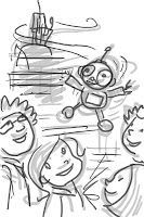
And that's enough of that diversion for the evening. Back to work so I can enjoy some free time over the holidays! Also, above are some illustrations from The Can Dance, a book for Imagine Learning. Can't have a post without a picture of something...

*bonus points if you can correctly guess the actual city used for the map in the top illustration.

Wednesday, December 10, 2008

Friendly Miscellany


Hey - finally something not Sugar Plum related! And some of it even seasonally relevant!

Above is an illustration I did for the December issue of The Friend magazine - always a great job. The initial illustration was done in Flash. Different layers were then imported into Photoshop. Once in Photoshop, I did a bit more shading to the solid areas than I have before. I think I like how it turned out. I like the flatter style as well though (see below).


This batch is from another article from The Friend. I think this was from the August issue maybe? I forgot. Done the same way - initially in Flash, then the layers are taken into Photoshop. A few touch-ups are added like rosy cheeks, plus a shadow is added by way of the Layers Blending Options. And finally a nice texture is put over the top of the whole thing.

And btw, moral of the story, in case you didn't piece it together: Stealing is Bad! :-)

Monday, November 10, 2008

rachel ray and toeshoe troubles


I suppose I should post something other than Sugar Plum Ballerinas news, but I don't really have any other news at the moment. Halloween is over, I'm loaded up with work as usual, and I'm trying to learn how to live in a world without dairy. Hallelujah there's no lactose in Diet Coke....

A bit short notice, Whoopi Goldberg will be on Rachel Ray promoting Sugar Plum Ballerinas on Tues, Nov 11.

And the cover for the second Sugar Plum book: Toeshoe Troubles, can now be seen at amazon.com (or if you're really clever, you can see it in this very same blog!) For those who read the first book (it is a really cute book - go buy it!) that's Brenda on the cover, with her snotty cousin Tiffany.

Friday, November 7, 2008

#3 on the new york times


Just got the word, Plum Fantastic has debuted at #3 on next week's NYT bestseller list, in the children's paperback category.

How cool!

Also in Sugar Plum Ballerina news, book #2: Toeshoe Trouble, is planned for May 2009 release, and the third book to follow Winter 2010.

And finally, Barnes and Noble has a short little video interview with Whoopi Goldberg at their site. It shows a few of the interior illustrations.

Thursday, October 23, 2008

sugar plums in the news


They have a clip of Whoopi's interview, and the first chapter of the book posted at Good Morning America's website.

She didn't mention the book on The View on Tuesday like I'd been told, but have since heard that will happen today, plus audience giveaway!

Edit:
Sugar Plum mention on The View:
http://www.youtube.com/watch?v=pUdU_4V1-Oc

Tuesday, October 21, 2008

more sugar plums


So I thought I'd have my own little media blitz here at the ol' blog, and post some more about the Sugar Plum books.

I'm often asked how I got hooked up with these books, and how Whoopi Goldberg became my BFF. First of all, I'm sure she's a lovely woman, but alas, as we have never met, no friendship bracelets have been exchanged. All of my interaction is with the fine folks at Jump at the Sun Publishing, an imprint of Hyperion Books, owned by Disney, who also owns ABC, on which airs Ms. Goldberg's show The View. Not sure any of that was important, but it's interesting, isn't it?

Over the years, I've done a lot of work for Jump at the Sun. One of my bigger projects with them has been a middle reader series called Willimena Rules! by Valerie Wilson Wesley. When the Sugar Plum books came along, the Jump at the Sun folks liked what I had done on the Willimena books and asked me to do some sample sketches of the main character Alexandrea (see above). Everyone approved the sketches (including Ms. Goldberg), and thus I was on the project. Pretty straightforward.

A little about the cover. The final cover, which can be seen in the previous post, started out a bit different. This sketch above was actually to be the spot on the back cover. It got moved to the front and the center girl (old version of the character Brenda) was replaced with Al.

From there is was just a matter of doing the final illustration in Photoshop using all my standard brushes, textures, etc.

Monday, October 20, 2008

sugar plum ballerinas #1


Tomorrow (Oct 21) is the official release of the first of a series of books by Whoopi Goldberg, which happen to be illustrated by me. Plum Fantastic is a really cute book, Ms. Goldberg came up with some pretty fun quirky characters, and I had a great time doing the illustrations. It's one those chapter books with the occasional b/w interior illustration (about 18 I think). There will be six books total; I'm in the midst of the second one at the moment, so watch for them over the next year or so.

Whoopi will be plugging the book this week on tv. As far as I know (these things change), she'll be talking about it Tuesday Oct 21 on The View. And on Thursday Oct 23, she'll be on Good Morning America and Regis and Kelly.

Friday, October 17, 2008

Bens and Cans


Chris, our Communications Director, graphic designer, all around makes things look good guy, just put the titles on my book covers, so thought I'd post them.

Months and months ago, I weaseled my way into writing some of the online books for our Imagine Learning paired readers activity. The way paired readers work is both relate to each other, in the sense the first prepares you with background knowledge for the second. Usually one is non-fiction and the other fiction. I was given the topics of community service and cause and effect. My first book idea was something more along the lines of that Connections show that used to be on PBS. Fantastic show. I traced the cause and effect from a plague-ridden flea 650 years ago to today's blockbuster pirate movie. Would have been fun to illustrate, unfortunately, it was way too complex for a 4th to 5th grade level book. So I started looking into the first volunteer fire company.

Once I started researching Ben Franklin's fire brigade, I found all sorts of things he did, so changed the topic to Ben's community building ideas. He created the first public library, first hospital, first fire brigade, reformed the postal service, and lots of other stuff. Good ol' Ben.

The second book - The Can Dance - is a little story about a girl who decides to have a can drive, and ultimately ends up on tv singing with her favorite pop star and her clever dancing pet duck (cause and effect!). When telling Chris about the plot, he said: "So, it's a Brady Bunch episode." And that pretty much sums it up.

Saturday, September 6, 2008

it's the most wonderful time of the year...


It's that time again where I spend a lot of time day dreaming about Halloween. This year is a little different - I'll be having a Dia de los Muertos party. I'll be periodically posting about the craft projects and party decorations in my other blog: The Two-Headed Goose.

Tuesday, August 19, 2008

sally ann thunder ann whirlwind crockett!


Hey! It's Sally Ann Thunder Ann Whirlwind Crockett!

Back eons ago when I was in ye olde illustration school, we had an assignment to illustrate a scene from a tall tale. Somehow I stumbled across the story of Sally Ann, and illustrated her twirling her rattlesnake lasso. And no, I won't be digging that out to share. Earlier this year when we were coming up with ideas for the next batch of stories at Imagine Learning, I pitched the idea of Sally Ann. One of our writers Shar did a great job putting her own spin on the story, and I staked my claim on getting to illustrate it.

So here are a few scenes from the story. Young Sally Ann asks a panther to dance, and they become best friends. A bit older, she runs across this poor feller with his head stuck in the fork of a tree (who knows how he managed that). Turns out it's Davy Crockett! Once she saves him with her rattlesnake lasso, they get married and live happily ever after. Uh... apparently they didn't remember the Alamo.


Technical notes... done in Photoshop. I kept the characters on a separate layer from the background so I could blur out areas. Using the Gaussian Blur (in Filter > Blur...) was a great trick since I could reuse other backgrounds and copy/paste all over the place. I think it helped make the characters pop a bit more as well, so a nice added benefit of trying to save time.

I pretty much stuck with three brushes for these illos. I made a custom brush for drawing the lines. I started with a default preset spatter brush, then adjusted the spacing, size jitter and angle jitter (in the brushes palette) until I got a brush that draws a bit like a crayon. For the shading I used the non-customized spatter brushes, and then did all the touch-ups with my crayon-ish spatter brush.

I also tried making another custom brush using a round airbrush. I used that one to make all the leaves on the trees and background bushes. It didn't work exactly how I wanted, but it got the job done.

Once the illustrations were done, I put a layer of a sandstone-type texture over the top, and set it to soft light. Sweet as sugar!

Wednesday, July 23, 2008

the studio


I haven't posted for a while, so I thought I would do something a little different. Instead of showing an illustration and describing how I work in Photoshop, I thought I'd describe how I work out there on the physical plane. Basically, here are some pictures of my studio, and I'll point out some of the tools I use.

First of all, most of the stuff in my studio is left over from Halloween. I never quite put it all away last year, and used some of my favorite things to decorate my studio. That sort of explains the framed eyeballs, skeleton arm stand and Vampire Emergency Kit.

Tools:

Mac G5 desktop computer.
Mine's a little old (it's hiding behind the monitor). It's pre-intel chips in macs, but it's a great computer. I've never had complaints about macs. The thing I really like in the latest OS is the Time Machine. I've got a 500gb external hard drive set up to do auto backups. It's pretty handy - cause you know when you haven't backed anything up for awhile, that's when your computer crashes, or you accidentally deleted that really important file.

At my inhouse job, I have a PC, and like it just fine. I'm not a big Apple snob, and Photoshop works the same on both. Macs just work for my brain (plus are so much prettier), so if I have to choose, I prefer working on a mac.

Samsung 305t 30" monitor.
I used to have two LCD apple display monitors. They were great, but eventually died after about 6 years. I was going to get the apple 30" cinema display to replace them, but when I started doing a little research, I found the Samsung beat Apple in just about everything - plus it was about $800 cheaper. Nice! It's a great monitor, super bright, excellent viewing angles, and if I bring a file from work to home, I can see lots more range of colors and values (like areas I thought were erased, but weren't.) Btw, I have two 20" Samsung SyncMaster 204t monitors at the dayjob. I'd say they're mid-range monitors.

Wacom Intuos 6x8" tablet.
Wacom tablets are the best thing ever. Because of this little thing, I basically no longer use paper. I can draw, sketch, paint, etc, as well, if not better than I could with traditional media. I like the 6x8 size. I don't like to move my hand or arm much when drawing, so it's the right size for me.

Just a side note about the Wacom Cintiq. Theoretically, and practically for some, this is the super coolest invention ever. I got one, and tried it, and ultimately hated it. I didn't mind the drawing on the screen part - that was a little weird at first, but not hard to get used to. I didn't like drawing like on a big drawing board, and felt like I was moving in slow motion to do anything since everything was so far away. I figured I could have gotten used to that as well eventually, but what I couldn't handle was the setup and logistics of the keyboard and extra monitor. Switching back and forth between monitors was a mess. I use the keyboard non-stop while painting, so programming the couple on-tablet buttons was not enough. The whole deal just made me cranky, and since I wasn't gaining anything I couldn't already do with the intuos, I packed up the cintiq and sent it back. On the other hand, one of my friends recently got one, and you'd think he'd died and gone to heaven, he loves it so much.

Epson 1280 Ink Jet Printer.
I don't print things often, but handy to have a printer that prints up to 13x19. It's been a great printer, and I just take it in to get cleaned every few years, and it's no worries.

Epson scanner.
I don't think I've used this since last year. I hardly ever draw on paper any more, so don't need to scan much. Nice to have one though, just in case. But as you can see, it has been relegated to the floor.

Lightbox.
Also relegated to the floor. It's that wood box leaning against the desk by the bookshelves (see below). I used to use it a lot, but good to still have just in case, so it's nice that it can be moved easily when I don't need it.

13" television.
Handy for watching/listening while working (need a break from iTunes now and then). Don't use it much, especially since I've been going through tv shows on DVD and hulu.com - but nice for late night talk shows.

Some tv show recs great for working (due to continued rewatchability): Ricky Gervais' Extras, The Office, The Flight of the Conchords, and Arrested Development.

iPhone.
Little white thing in front of the tv is my iPhone dock. I can see why some people prefer other phones, or Blackberries or whatever, but I love, LOVE my iPhone. When I got it I finally got rid of my land phone line, since I was forwarding those calls to my cel anyway. It leaves me without a line for a fax machine, but I hardly ever used that either, so instead I scan and email any documents I would have faxed in the past.

Everything else is your standard office stuff. The bookshelves are full of illustration-related and children's books. I've two more bookshelves out in the front of the house where all my non-fiction/reference type books live. Luckily, finding reference online has curbed my book buying quite a bit.

And that's about it. Questions? Anyone? Bueller?


Sunday, June 1, 2008

imagine island :: world premiere


Last Friday was the World Premiere of the Imagine Island TV show. We had a big party up at the BYU to screen one of the episodes. The show was produced in partnership with KBYU and will be broadcast all over Latin America. It uses a lot of content from the Imagine Learning English software, bridged by a story with a live action actor filmed on green screen - sort of a Blues Clues model.

I've been the go-to artist whenever the video guys need some new art for the show. One of the first things I had to do was make a portrait of Jack (the explorer dude) and Booster (the robot) in a cubist sort of style. Pretty fun to do. Also, you can see what the clown car was for that I posted a few weeks back. And finally, I posted that last screenshot of the dollhouse cause all that dollhouse furniture is mine from when I was a kid. It is actually bearhouse furniture since bears lived in my house... anyway. See! It does pay to be a packrat.

Thursday, May 29, 2008

magician's duel


Here's a little test screen for one of my current projects. This is going to be an animation about plurals, as demonstrated by a magician's duel.

The background was painted in Photoshop. I thought I'd try the whole rendered background vs. flat characters look.

The characters are built in Flash. You can't tell in this screenshot, but the characters are made of lots of separated out pieces: legs, hands, feet, heads, faces, etc. Then I can go and animate them sort of like puppets. I'm not much of an animator, so trying to animate a magical duel is going to be a bit of a challenge. Should be fun though.

Monday, May 19, 2008

level two poster - tutorial


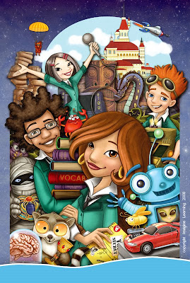
A few weeks ago, our Marketing/Sales folks asked us to make some big posters for our products - super exciting! I was assigned the Level Two poster, since I had originally designed the characters. I finally finished it last week - it was a huge painting: 24x36 inches and of course, I opted to stuff everything I could into it.

This isn't an overly comprehensive tutorial, but will walk through some of the steps.

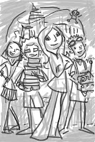
First step: Thumbnails
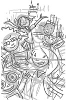
I did these as actual size, but 72 dpi, and as you can see, I didn't really go into too much detail at this point. The idea was to figure out the poster content. You can see two layers. The first layer was the initial scribbling that then had the opacity dropped down. The second layer is a darker little bit tighter sketch. I did four versions, and between myself and the other artists, we all liked the one that was going to be the most work - of course!


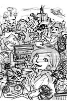
Step Two: The Comp
There was actually a version between the thumbnail and the comp below, but apparently I didn't save a copy of it. After picking the third thumbnail, I pasted in some of the reference artwork from the product, and did sketches of everything else to start working out how it was all going to fit together. That was the version I showed to the Sales folks for approval, so they didn't have to do too much guesswork.

From there I did a fairly tight sketch (for me anyway) at full size and final dpi. Each character or thing was drawn on a separate layer, with another layer of rough color beneath the lines layers. This made it easy to slide things around and refine the composition.


A little later I decided it would help contain the busy-ness to have a little border on the sides. While I was in the middle of rendering all the pieces, our graphics guy decided to have a blue band with company info and logo as a common feature of all the posters (you can see my temp version of the bar in the final above.)

Step Three: Finish
Once the comp version was all worked out, I started to work on each character/thing individually. For this tutorial, I'll show the progression of one of the main characters: Alex.


This is the Alex sketch from the comp - just with everything else turned off. She has two layers at this point - the line drawing and the color fills. I went in on the line layer and cleaned up the line a little - shaved it down with the eraser tool, etc. Then I went in and cleaned up the color layer a little bit. I'm using the simple round brushes and soft round brushes to do this.


Cleaning up the sketch rather than redrawing on a new layer isn't necessarily faster, but I'm a bit crap at drawing nice lines without having to clean them up. So why bother with an extra tracing step? And it also helps keep the drawing fresh.
So now I use the magic wand tool and select the areas of color on the color layer. I always start with skin since the face is the most important part. I use the soft round brushes to do some shading. This isn't meant to be final shading - think of it as an underpainting.


All the major areas are roughly shaded, so it's time to color the lines. Since I drew them originally on a transparent layer, all I need to do is turn on the Preserve Transparency button, and I can color the lines a few shades darker than the filled-in areas. Sometimes I make the exact color of the line using the color sliders on the color palette and then color at 100% opacity. Other times I select the darkest color of shading, set my brush to 50% opacity, and then paint on the black line. All turns out the same either way.


After the lines are colored, I merge the two layers together. I go in with either soft or hard round brushes, and continue cleaning up the lines and the shading. This part of the process is kind of hard to describe, and probably if I can ever figure out how, should be shown as a video. I'm constantly changing brush size and opacity and using CTRL to toggle to the eyedropper tool to select colors. Above you can see the head and hair are pretty much cleaned up.


Here's Alex all done. I went through the same process on all the other layers of stuff. Once everything was done, I went through each layer and used Blending Options in the Layers Palette to add a drop shadow. Once I have the shadow working on one layer, I can right click on that layer and select Copy Layer Style. Then I right click on all the other layers and choose Paste Layer Style.

From there I did a little fancy cutting and pasting of the blue starfield to cover up some areas. The finishing touch was a layer of a rock texture set to soft light over the whole thing. I then sent it off to our graphics guy to add the blue bar and corporate logo and all that business. Took a fair amount of time to do, but I really enjoyed working on it.

Monday, May 5, 2008

may miscellany


Here are a bunch of random things I've done lately. I've been doing a lot of little illustrations for our video guys for a big project they are working on. It's been really fun - my favorite project for them was a pirate map style board game they needed for a physical prop.

Interesting bit of continuity. My first real job was working at an educational software company called Waterford Institute. My first project there was an animation of an iguana in an igloo. 14 years later... still drawing iguanas and igloos.

Currently I'm working on a huge poster for Imagine Learning Level Two - I'll have a little tutorial for that once it's done. Also loaded up with freelance as usual. Busy busy.

Wednesday, April 2, 2008

my Friend ricky


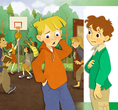
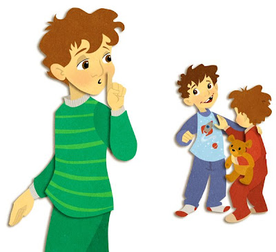
I've been hearing that the April issue of The Friend is out there, so here are the illustrations I did for it (way back in January). The Art Director there is fantastic to work with, and let me decide which style to illustrate the article. The top illustration is part of a full spread - the white edge between the boys is actually the gutter. The second illustration was a spot for the third page of a three page story.

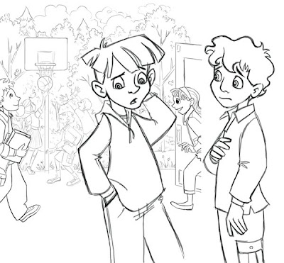
There's not too much to describe in the step-by-step. The art director gave me pretty tight comps as a base for my sketches, and everything went smoothly from there.

I imported the sketch (done in Photoshop) into Flash. I used the pencil tool to trace, and then filled in all the shapes. Then I went and deleted all the outlines.


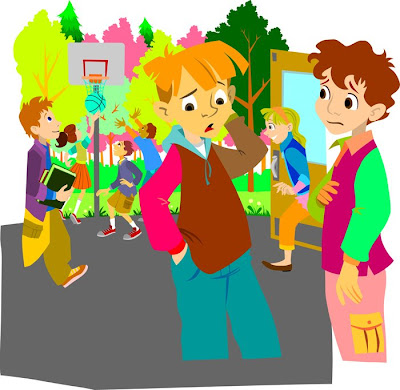
This is what it looked like when I was done in Flash. Not every color is a different layer, but there were a lot. When I exported layers, I grouped together areas where I wanted there to be a drop shadow. (In Flash, go to File>Export>Export Image... and then select .png as the image format so you keep the transparency.)

I then imported all those separate layers into Photoshop and combined them into one big ol' file. The spread had 26 layers, and 10 for the little page 3 spots. Once in photoshop I adjusted all the colors, added a Drop Shadow in the Blending options. I added a little extra detail here and there like tree leaves, asphalt stones, blush on the faces, but really there wasn't much. I added a Guassian blur to some of the tree layers to push them back into the distance a little, and then finally on top layer I had a photo of a stone texture that I set to Soft Light.