Thursday, May 29, 2008

magician's duel


Here's a little test screen for one of my current projects. This is going to be an animation about plurals, as demonstrated by a magician's duel.

The background was painted in Photoshop. I thought I'd try the whole rendered background vs. flat characters look.

The characters are built in Flash. You can't tell in this screenshot, but the characters are made of lots of separated out pieces: legs, hands, feet, heads, faces, etc. Then I can go and animate them sort of like puppets. I'm not much of an animator, so trying to animate a magical duel is going to be a bit of a challenge. Should be fun though.

Monday, May 19, 2008

level two poster - tutorial


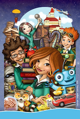
A few weeks ago, our Marketing/Sales folks asked us to make some big posters for our products - super exciting! I was assigned the Level Two poster, since I had originally designed the characters. I finally finished it last week - it was a huge painting: 24x36 inches and of course, I opted to stuff everything I could into it.

This isn't an overly comprehensive tutorial, but will walk through some of the steps.

First step: Thumbnails
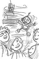
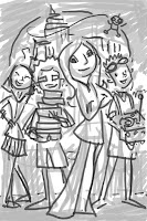
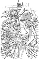
I did these as actual size, but 72 dpi, and as you can see, I didn't really go into too much detail at this point. The idea was to figure out the poster content. You can see two layers. The first layer was the initial scribbling that then had the opacity dropped down. The second layer is a darker little bit tighter sketch. I did four versions, and between myself and the other artists, we all liked the one that was going to be the most work - of course!


Step Two: The Comp
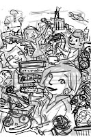
There was actually a version between the thumbnail and the comp below, but apparently I didn't save a copy of it. After picking the third thumbnail, I pasted in some of the reference artwork from the product, and did sketches of everything else to start working out how it was all going to fit together. That was the version I showed to the Sales folks for approval, so they didn't have to do too much guesswork.

From there I did a fairly tight sketch (for me anyway) at full size and final dpi. Each character or thing was drawn on a separate layer, with another layer of rough color beneath the lines layers. This made it easy to slide things around and refine the composition.
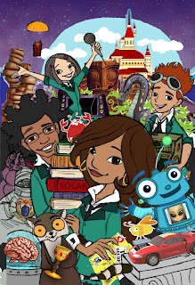


A little later I decided it would help contain the busy-ness to have a little border on the sides. While I was in the middle of rendering all the pieces, our graphics guy decided to have a blue band with company info and logo as a common feature of all the posters (you can see my temp version of the bar in the final above.)

Step Three: Finish
Once the comp version was all worked out, I started to work on each character/thing individually. For this tutorial, I'll show the progression of one of the main characters: Alex.
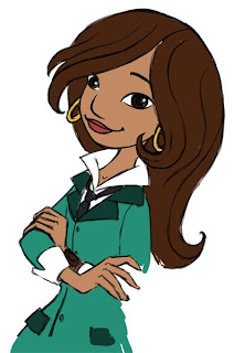


This is the Alex sketch from the comp - just with everything else turned off. She has two layers at this point - the line drawing and the color fills. I went in on the line layer and cleaned up the line a little - shaved it down with the eraser tool, etc. Then I went in and cleaned up the color layer a little bit. I'm using the simple round brushes and soft round brushes to do this.
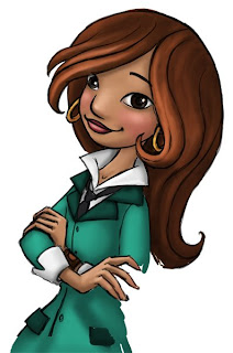


Cleaning up the sketch rather than redrawing on a new layer isn't necessarily faster, but I'm a bit crap at drawing nice lines without having to clean them up. So why bother with an extra tracing step? And it also helps keep the drawing fresh.

So now I use the magic wand tool and select the areas of color on the color layer. I always start with skin since the face is the most important part. I use the soft round brushes to do some shading. This isn't meant to be final shading - think of it as an underpainting.
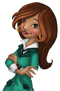


All the major areas are roughly shaded, so it's time to color the lines. Since I drew them originally on a transparent layer, all I need to do is turn on the Preserve Transparency button, and I can color the lines a few shades darker than the filled-in areas. Sometimes I make the exact color of the line using the color sliders on the color palette and then color at 100% opacity. Other times I select the darkest color of shading, set my brush to 50% opacity, and then paint on the black line. All turns out the same either way.
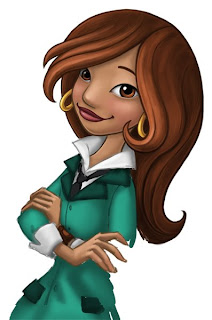


After the lines are colored, I merge the two layers together. I go in with either soft or hard round brushes, and continue cleaning up the lines and the shading. This part of the process is kind of hard to describe, and probably if I can ever figure out how, should be shown as a video. I'm constantly changing brush size and opacity and using CTRL to toggle to the eyedropper tool to select colors. Above you can see the head and hair are pretty much cleaned up.
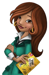


Here's Alex all done. I went through the same process on all the other layers of stuff. Once everything was done, I went through each layer and used Blending Options in the Layers Palette to add a drop shadow. Once I have the shadow working on one layer, I can right click on that layer and select Copy Layer Style. Then I right click on all the other layers and choose Paste Layer Style.

From there I did a little fancy cutting and pasting of the blue starfield to cover up some areas. The finishing touch was a layer of a rock texture set to soft light over the whole thing. I then sent it off to our graphics guy to add the blue bar and corporate logo and all that business. Took a fair amount of time to do, but I really enjoyed working on it.

Monday, May 5, 2008

may miscellany


Here are a bunch of random things I've done lately. I've been doing a lot of little illustrations for our video guys for a big project they are working on. It's been really fun - my favorite project for them was a pirate map style board game they needed for a physical prop.

Interesting bit of continuity. My first real job was working at an educational software company called Waterford Institute. My first project there was an animation of an iguana in an igloo. 14 years later... still drawing iguanas and igloos.

Currently I'm working on a huge poster for Imagine Learning Level Two - I'll have a little tutorial for that once it's done. Also loaded up with freelance as usual. Busy busy.

Wednesday, April 2, 2008

my Friend ricky


I've been hearing that the April issue of The Friend is out there, so here are the illustrations I did for it (way back in January). The Art Director there is fantastic to work with, and let me decide which style to illustrate the article. The top illustration is part of a full spread - the white edge between the boys is actually the gutter. The second illustration was a spot for the third page of a three page story.

There's not too much to describe in the step-by-step. The art director gave me pretty tight comps as a base for my sketches, and everything went smoothly from there.

I imported the sketch (done in Photoshop) into Flash. I used the pencil tool to trace, and then filled in all the shapes. Then I went and deleted all the outlines.


This is what it looked like when I was done in Flash. Not every color is a different layer, but there were a lot. When I exported layers, I grouped together areas where I wanted there to be a drop shadow. (In Flash, go to File>Export>Export Image... and then select .png as the image format so you keep the transparency.)

I then imported all those separate layers into Photoshop and combined them into one big ol' file. The spread had 26 layers, and 10 for the little page 3 spots. Once in photoshop I adjusted all the colors, added a Drop Shadow in the Blending options. I added a little extra detail here and there like tree leaves, asphalt stones, blush on the faces, but really there wasn't much. I added a Guassian blur to some of the tree layers to push them back into the distance a little, and then finally on top layer I had a photo of a stone texture that I set to Soft Light.

Friday, March 7, 2008

spring?


Here's a happy butterfly in honor of spring - or at least getting faked out that it *might* be spring. Good ol' Utah. Don't really have anything new to post. It seems most everything I've been working on lately has either been something I can't post, or isn't really worth posting. Maybe I'll have something interesting to post next week.


One small bit of fun from Imagine Learning - I did finally get a two-headed goose into the product. It is an icon meant to represent something "unusual." Hooray for the two-headed goose.

Sunday, February 3, 2008

Monday, January 7, 2008

pink drawing


And here's another little rough warm-up drawing. It's kinda fun coloring these loose sketches without having to worry about them being all nice and clean.

green drawings


Happy New Year everyone! I hope 2008 is a fabulous year for us all.

I've been working on a tutorial of one of the pictures from the missing manny book, but it's kind of epic, and i'm kind of epically busy this month, so it's slowly getting put together. So above is an attempt to post at least *something* before we get too far along into the new year.

These are some quick sketches and random doodles from this morning as I was trying to get into the work groove. Tutorial coming soon... hopefully in the next week or so.

Monday, December 10, 2007

missing manny


Hey - happy December everyone!

Here are a few pages from my latest little book at Imagine Learning. It's a pretty fun little story about a missing person mystery on the set of a pirate movie (haven't gotten to any of the pirate stuff yet.) This is just your basic draw and color it all in photoshop style. Also, my detective is a not so subtle homage to Emerson Cod of Pushing Daisies. If you've never seen it, hop on over to abc.com and watch a few episodes. Love, love, love this show..

Wednesday, November 21, 2007

Don't Fence Me In


Here are some more illos from my little immigration book. It was a fun book to do since I like working in this style. The downside is that I had to do them so fast, there's really no time for careful planning and had to just sort of wing it. Sometimes it worked, sometimes it didn't work quite so well. I did kind of go nuts with the gaussian blur with this book, but it saved time since if it was gonna be blurry anyway, didn't have to spend too much time on it.

On the Illustration: Friday front, guess I didn't even make it the first week of my new resolve. I blame the Holiday. I had a really cool superstition to use too... oh well. I will try to get one done next week.

Wednesday, November 14, 2007

Illustration Friday: Scale


I haven't posted to IF forever, so I think that will be a new goal to try to do something quick every week. We'll see if I actually do it... And since it's a little too late this week to start, I have two scale pictures from a book about gravity that I worked on this past summer.

Wednesday, November 7, 2007

The Mighty Mayflower


I haven't posted anything from Imagine Learning for a while. This illustration of the Mayflower is from a little book I've been working on called Don't Fence Me In. I seem to be getting the immigration-themed books lately, since my other book I just finished is about the Statue of Liberty (mostly photos, so no illos to post).

This was done primarily in Flash. The ship was exported in about 7 layers, plus two layers of ocean. The .pngs are all imported into Photoshop, where I add a Drop Shadow to each layer. The back layer of ocean got the gaussian blur filter treatment. There is a texture layer over the top, I think it's a photo of a rock, set to Soft Light. I airbrushed a little on the sails, the sky, and around the outside edges, and that was basically it.

Wednesday, October 31, 2007

Gallery of Terror


Happy Halloween!

Years ago I worked at a place called Waterford Institute. While I was there, a tradition known as The Gallery of Terror was started. Even though very few of us still work there, the tradition has continued.

This year I did two pieces for two Galleries of Terror. The first, the giraffe (or, as I have decided to name him: Pongo Zarafa) was done to hang in my house for my annual Halloween Extravaganza. It is a copy of a painting that hung on the wall of the set of the tv version of the Addams Family. Also posted for Jeff Davis'Official Gallery of Terror.

The second picture: The Maryn, was painted for our Gallery of Terror at Imagine Learning. Kind of a long story to explain where this comes from, so I won't bother. :-)

Have a fabulously kooky, ooky and spooky Halloween!