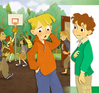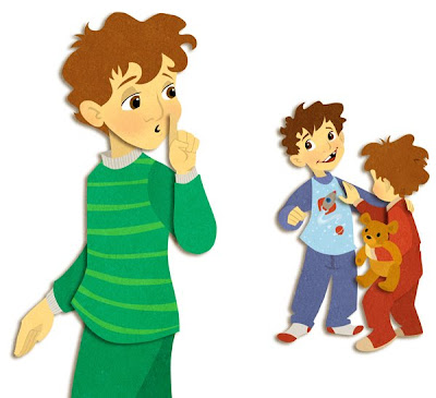

I've been hearing that the April issue of The Friend is out there, so here are the illustrations I did for it (way back in January). The Art Director there is fantastic to work with, and let me decide which style to illustrate the article. The top illustration is part of a full spread - the white edge between the boys is actually the gutter. The second illustration was a spot for the third page of a three page story.
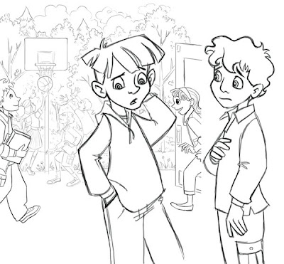
There's not too much to describe in the step-by-step. The art director gave me pretty tight comps as a base for my sketches, and everything went smoothly from there.

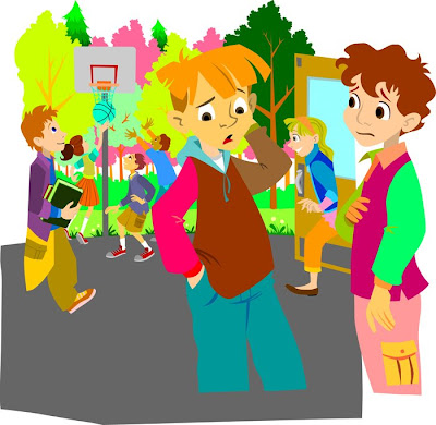
I imported the sketch (done in Photoshop) into Flash. I used the pencil tool to trace, and then filled in all the shapes. Then I went and deleted all the outlines.

This is what it looked like when I was done in Flash. Not every color is a different layer, but there were a lot. When I exported layers, I grouped together areas where I wanted there to be a drop shadow. (In Flash, go to File>Export>Export Image... and then select .png as the image format so you keep the transparency.)
I then imported all those separate layers into Photoshop and combined them into one big ol' file. The spread had 26 layers, and 10 for the little page 3 spots. Once in photoshop I adjusted all the colors, added a Drop Shadow in the Blending options. I added a little extra detail here and there like tree leaves, asphalt stones, blush on the faces, but really there wasn't much. I added a Guassian blur to some of the tree layers to push them back into the distance a little, and then finally on top layer I had a photo of a stone texture that I set to Soft Light.

5 comments:
So cool! i better go buy this issue of the Friend.
I saw this in the friend this month and loved it. Thank you for doing a step by step!
Hi.
What a lucky find! I saw this art in the Friend this morning and meant to look it up. I was just doing a search for a Flash to layered PSD plugin and your old blog popped up. Awesome. I love your work!
I also prefer doing line work in Flash. Too many bells and whistles confuse me and Flash is straight forward. I only wish is handled CMYK as I just found out it didn't after I worked on a piece that needed to be in ai. I had seen the ai export and figured it would be ok -wrong.
I'm off to mention your blog to a couple of friends.
brilliant work!
Your characters have so much life in them.
Beautiful! Thanks for the step by step.
Post a Comment